It started one rainy Saturday afternoon.
I was sitting in my small Denver apartment, staring at the beige walls that had followed me from one rental to another. Everything felt… dull. The couch was comfortable, the coffee table was solid, but somehow the room lacked life.
Then it hit me — it wasn’t the furniture. It was the color.
Colors aren’t just decoration; they are the emotional DNA of your home. They tell stories, set moods, and can make a small space feel expansive or a cavernous room feel cozy. And the living room — the heart of every American home — deserves color that reflects how you live today.
So, I dove deep. I spoke with interior designers from Los Angeles to Nashville, looked through paint decks, Pinterest boards, and even color psychology studies. What I discovered was eye-opening: you don’t need a full remodel — just a color refresh can completely transform your living room.
Here are 7 color updates that have the power to do just that — each with its own personality, backstory, and magic.
1. The New Neutrals: Warm Whites and Soft Beiges with Depth
When Emily, a young mom in Austin, repainted her living room from cool white to a creamy off-white called Swiss Coffee, something surprising happened — her husband actually noticed.
“It suddenly felt warmer, like the sunlight lingered longer,” she said.
🌤 Why It Works:
For years, America’s living rooms were painted in stark whites or grays — cool tones that promised modern minimalism. But in 2025, design has circled back to warmth and imperfection. The new neutrals — like Benjamin Moore’s White Dove or Sherwin-Williams’ Shoji White — bring an organic softness that pairs beautifully with wood furniture, leather couches, and textured rugs.
💡 Designer Tip:
If your living room faces north or doesn’t get much sunlight, avoid crisp blue-tinted whites. Instead, pick neutrals with a yellow or red undertone to balance the cooler light.
🏠 Perfect For:
-
Farmhouse, bohemian, and Scandinavian interiors
-
Homeowners who love a “natural” or cozy aesthetic
-
Renters who want subtle but noticeable change
2. Deep Greens: Nature’s Calm Powerhouse
Imagine walking into a room and instantly feeling grounded — like stepping into a forest cabin after a long week. That’s the effect of deep green walls.
After the chaos of the pandemic years, Americans craved peace and balance. Designers noticed — and green became the “new neutral.”
🌿 The Mood:
Green connects us to nature and stability. Shades like Evergreen Fog (Sherwin-Williams) or Essex Green (Benjamin Moore) bring luxury and calm in equal measure.
I met a homeowner in Oregon who painted just one accent wall in a moody green and replaced her throw pillows with mustard yellow and walnut tones. “Now it feels like the Pacific Northwest inside my house,” she laughed.
💡 Designer Tip:
Pair deep greens with brass, gold, or matte black finishes. Add in natural fibers — rattan, jute, linen — to soften the visual weight.
🏠 Perfect For:
-
Urban dwellers craving nature vibes
-
Modern, rustic, or traditional homes
-
Spaces with large windows or lots of greenery outside
3. Earthy Terracotta: A Warm Embrace You Didn’t Know You Needed
If you’ve ever visited Arizona or New Mexico, you’ve seen it — that sunbaked, earthy orange that wraps the landscape like a desert hug.
Terracotta has made a huge comeback across U.S. interiors. Why? Because it’s warm, grounding, and endlessly cozy — everything a living room should be.
🔥 The Mood:
Terracotta and burnt sienna remind us of clay pots, sunsets, and coffeehouse comfort. They work wonders in colder regions like the Midwest or Northeast, where winters can make rooms feel cold.
Designer Kate Lester calls terracotta “the color of American warmth” — and she’s right. It pairs beautifully with deep navy, warm beige, or olive.
💡 Designer Tip:
If you’re not ready to commit to full walls, paint just the fireplace wall or a low wainscot in terracotta and keep the upper walls cream. Add warm lighting and it’s instant mood magic.
🏠 Perfect For:
-
Southwestern, mid-century, or rustic homes
-
Anyone who loves a cozy, golden-hour glow year-round
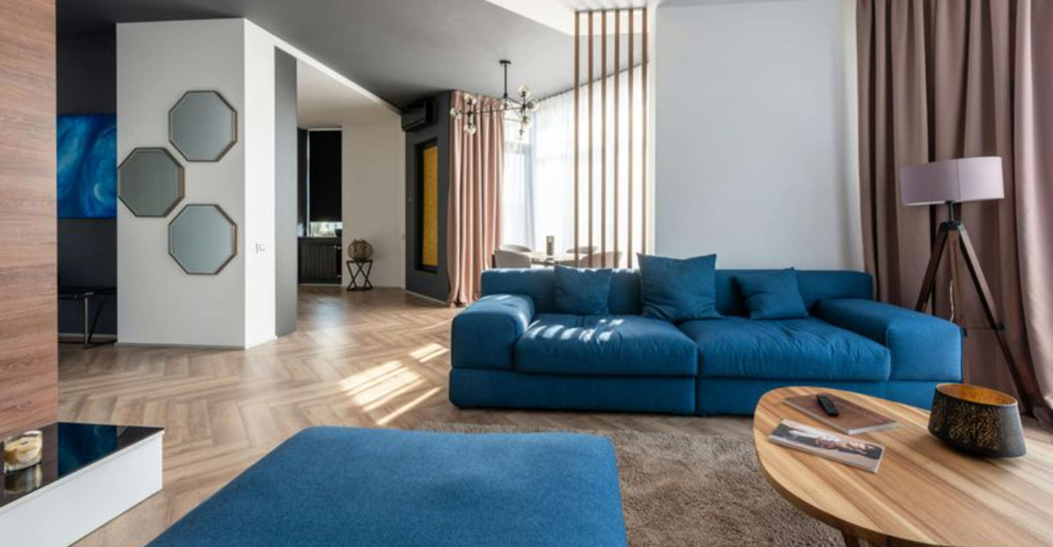
4. Moody Blues: The Color of Quiet Confidence
Blue has always been America’s favorite color — but not all blues are created equal.
Forget the nautical navy or baby blue of the past. The new trend is moody blues — deep, complex tones like Hague Blue (Farrow & Ball) or Naval (Sherwin-Williams).
When you walk into a moody blue living room, it feels like slipping into a tailored suit. It’s sophisticated without being cold, powerful but serene.
🌊 The Mood:
Blue inspires trust and introspection. It’s ideal for homes where people gather for conversation, reading, or relaxation.
💡 Designer Tip:
To avoid making the room feel too dark, balance moody blue with light upholstery, cream curtains, or metallic accents (gold or bronze work beautifully).
Add greenery — plants pop dramatically against dark blue walls.
🏠 Perfect For:
-
City apartments and traditional homes
-
Spaces with lots of natural light
-
Those who love timeless, classy interiors
5. Muted Pinks and Blush Tones: Sophisticated Softness
Pinks aren’t just for nurseries anymore. Today’s dusty blush or muted rose shades add warmth, style, and even gender-neutral sophistication.
Interior designer Bobby Berk once said, “Pink is the new beige — it’s the soft neutral that flatters everything around it.”
🌸 The Mood:
Pinks like Sulking Room Pink (Farrow & Ball) or Rosé Tan (Sherwin-Williams) give the room a romantic yet grounded aura. They reflect light beautifully and complement gray, brass, and white.
I once saw a Brooklyn brownstone with blush walls, black window trims, and a vintage rug — it looked like a living piece of art.
💡 Designer Tip:
If you’re nervous about going pink, start small — paint your built-in shelves, a door frame, or the area behind your TV console.
🏠 Perfect For:
-
Young professionals or design lovers
-
Modern, eclectic, or Scandinavian interiors
-
Small living rooms — blush makes them look airy and inviting
6. Charcoal and Black: Bold, Modern, and Unexpected
Black walls in a living room? It sounds intimidating — until you see it done right.
When styled with intention, charcoal and black can make a room look more spacious, not smaller. The color recedes visually, creating a dramatic but elegant cocoon.
🖤 The Mood:
Black adds a touch of mystery and modern confidence. It’s the color of sleek city lofts, industrial spaces, and statement-making homeowners.
In Chicago, a designer couple painted their living room Tricorn Black (Sherwin-Williams), then added cognac leather sofas, gold lighting, and cream art frames. The result? Chic, moody, unforgettable.
💡 Designer Tip:
Use matte finishes — they hide imperfections and soften reflections. Always contrast black with warm lighting and texture (think linen curtains or wool throws).
🏠 Perfect For:
-
Modern, industrial, or masculine interiors
-
Homeowners who love contrast and depth
7. Coastal Light Blues and Seafoam: A Breath of Fresh Air
Not all living rooms need drama. Some need lightness — a place to breathe.
Soft blues, seafoam, and misty aqua shades bring that sense of coastal calm no matter where you live.
🌬 The Mood:
These colors evoke open skies and ocean breezes. They’re perfect for homes in California, Florida, or any place where natural light is abundant.
They work especially well with white trim, woven textures, and natural materials like driftwood or cane.
💡 Designer Tip:
Choose blues with gray undertones for sophistication. Pair them with warm woods and off-white walls for a balanced look.
🏠 Perfect For:
-
Coastal, beach, or coastal-inspired interiors
-
People craving calm, open, minimalist spaces
🎨 How to Choose the Right Color for Your Living Room
Choosing a color isn’t about trends — it’s about energy. Ask yourself:
-
Do I want my living room to feel calm, cozy, or energized?
-
What time of day do I use it most? (Natural light changes everything.)
-
What colors make me feel good when I wake up or unwind?
Here’s a simple cheat sheet:
| Mood | Best Colors | Avoid If… |
|---|---|---|
| Calm | Soft blues, greens, taupe | Your room already feels cold |
| Cozy | Terracotta, beige, blush | Your space lacks natural light |
| Energized | Mustard, coral, sage | You prefer minimalist decor |
| Sophisticated | Charcoal, navy, olive | Room is too small or dark |
🖌️ Bonus: Small Ways to Add Color Without Painting
Not ready for a full repaint? You can still transform your space with color accents:
-
Throw pillows & rugs: Try layered textures in contrasting tones.
-
Artwork: Choose large-scale art that anchors your color palette.
-
Curtains: Soft fabrics in muted shades can shift the entire mood.
-
Bookshelves: Paint just the interior of shelving in a bold color.
-
Lighting: Warm bulbs (2700K–3000K) enhance rich tones and reduce harshness.
Color isn’t just on your walls — it’s in your textiles, light, and even how you arrange furniture.
🪞 Real-Life Story: How a Single Color Changed Everything
Last spring, a couple from Minneapolis — Sam and Heather — decided to repaint their small living room. They were both teachers, working from home part-time, and their walls were plain gray.
Heather said, “It felt like we were living inside a cloudy day.”
After weeks of browsing paint chips, they chose Sage Green. Within a weekend, their entire home energy shifted.
“It’s weird,” Sam said, “but we talk more in that room now. It feels alive.”
Their story isn’t unique. Across the U.S., families are discovering that color isn’t cosmetic — it’s emotional architecture.
When you shift your palette, you shift how you live.
🏡 Final Thoughts: Your Living Room, Reimagined
Color isn’t about following Pinterest trends or impressing guests. It’s about creating a space that feels right for you.
Your living room should tell your story — whether it’s a terracotta sunset in Tucson, a coastal blue morning in Maine, or a deep green forest retreat in Oregon.
Because when you choose the right color, you don’t just decorate your home — you redefine how it feels to live there.
❓FAQs About Living Room Color Updates
Q1: How often should I update my living room colors?
Most designers suggest a refresh every 5–7 years, or sooner if your space feels dull. Paint fades, trends evolve, and your life changes — your colors should too.
Q2: What color makes a small living room look bigger?
Lighter tones like warm white, pale beige, or soft blue reflect light and visually expand space. Pair them with mirrors and minimal furniture.
Q3: Are dark colors bad for small spaces?
Not necessarily. Dark, matte colors can create depth and make a room feel cozy. Just add contrast with lighter décor or lighting.
Q4: How do I test paint colors before committing?
Always use sample swatches or peel-and-stick paint samples. View them at different times of the day under both natural and artificial light.
Q5: Which colors increase resale value?
Buyers in the U.S. tend to prefer neutral tones — warm whites, greige, and soft gray. But accent colors like navy or sage can add personality without scaring buyers away.
Q6: Should ceiling and wall colors match?
Matching colors can make ceilings feel lower but cozier. A lighter ceiling (10–20% lighter shade of wall color) opens the space visually.
Q7: What’s trending in 2025 for living room colors?
Americans are leaning toward earthy, comforting palettes — think terracotta, olive green, beige, and muted blue. “Quiet luxury” and “natural warmth” are the big trends this year.